
DeLaurenti House Wines: The Design Process
If you’ve noticed more bottles with our name on them over the last ten years, it’s not in your head. It’s a relatively new thing. The first was a Prosecco in 2016, sourced by then-wine buyer Noah Oldham. It’s still one of the ten best-selling items in the store.
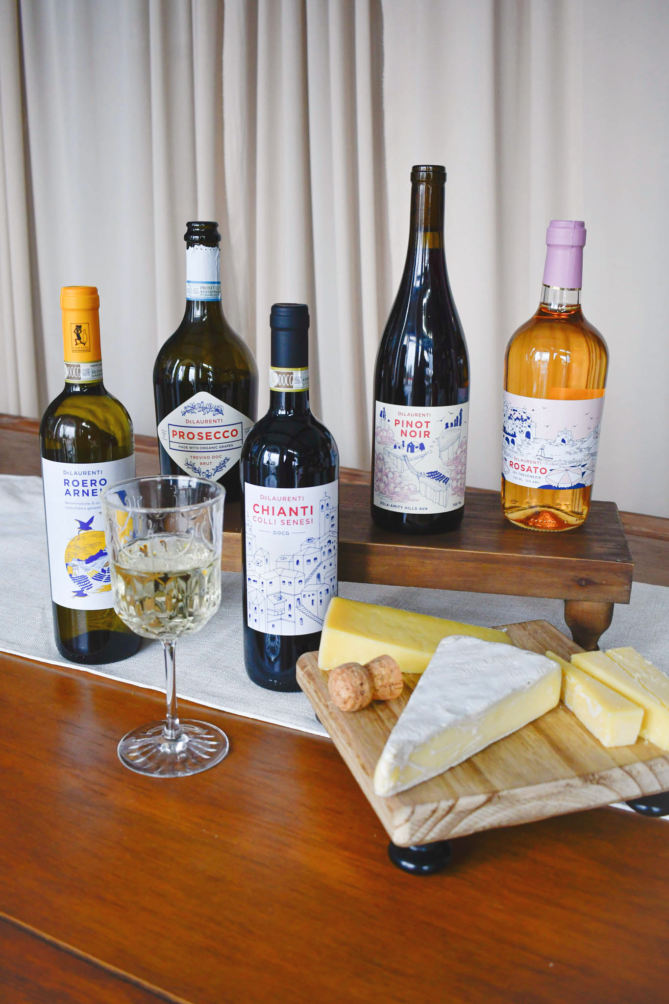
More have followed, all from the same two people: wine buyer Tom Drake picks the wine, and Angela Revell, a local graphic designer who has worked with us since 2016, draws the label.
These are approachable wines, and the labels should say so. Nothing austere. Just a label that feels like the wine it’s wrapped around. Angela wants each label to feel personal, like we’re joining you at the table.
Prosecco: starting simple
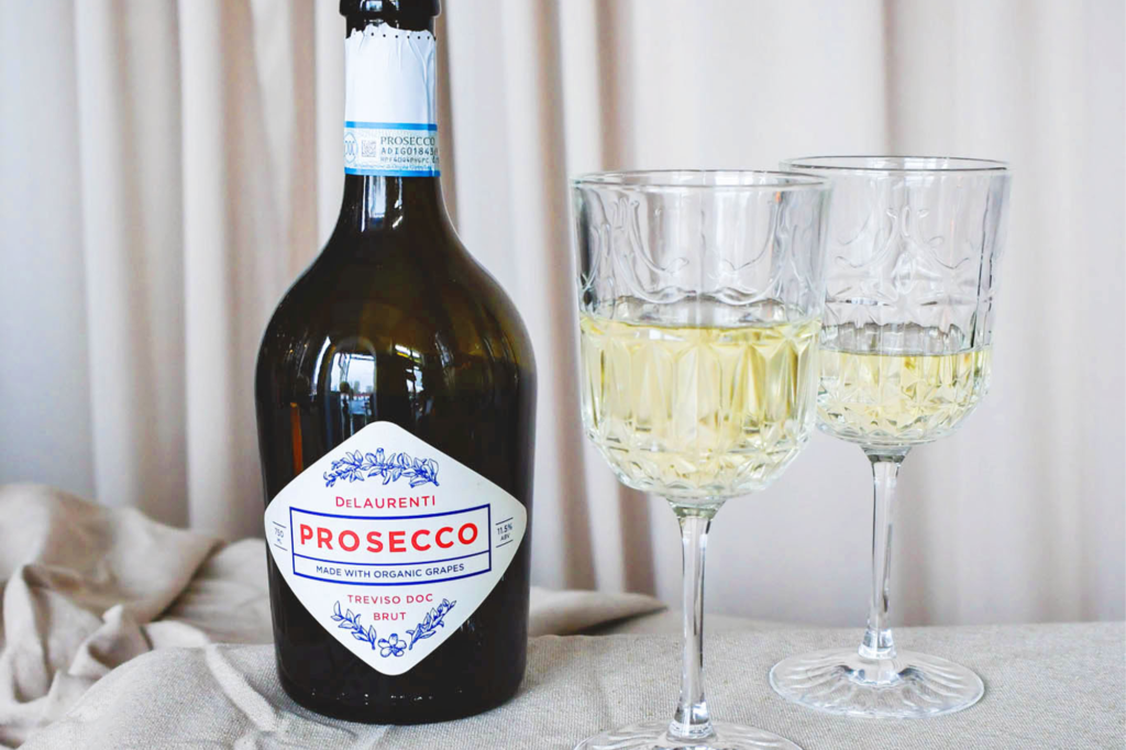
The Prosecco label set the tone. Apple and pear boughs, minimal type, a clean layout cut with a diamond die so it looks made for the bottle. Angela says, “The goal was a bottle that would appeal to longtime customers and to someone walking into the shop for the first time.” She wanted the label to feel like a quality classic that is approachable — DeLaurenti in a nutshell. Stay tuned for a new Prosecco and a fresh take on the label this winter!
Chianti: a sense of place
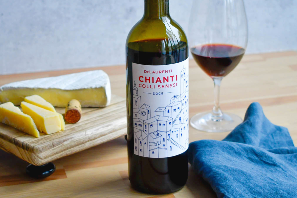
“The Chianti was next,” says Tom. “I feel like that’s where we started getting everything dialed in.” The wine comes from Antico Colle, a family-run estate in Montepulciano, and Tom wanted the label to show the wine’s home. “Tom’s vision of communicating a sense of place without being strictly tied to a specific vineyard or estate is a great approach,” says Angela. She drew the town’s skyline as a composite, built from the architectural style of Montepulciano. “I added extra little rooms and staircases that don’t have to make sense,” she says. “I wanted people to feel like they could imagine themselves behind those windows, in those little rooms, going up those stairs.”
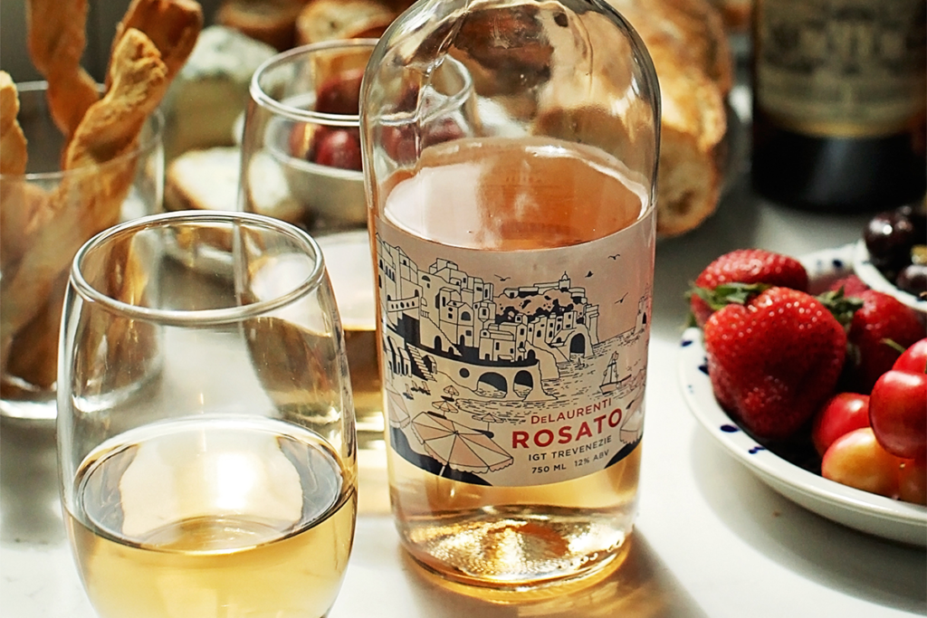
Rosé: a state of mind
The rosé label isn’t a real beach. The wine is made in Tuscany by Tenuta Cappellina. “It drinks like the rosés of Provence, and the summer you see on the label is what you get in the glass,” says Tom. DeLaurenti co-owner Matt Snyder shared a dream afternoon on the Amalfi coast that involved a ride on a fishing boat to a beachside restaurant called Da Adolfo. “We tried to capture the feeling of finding your way to that hidden beach club,” says Angela. The label may not steer you to a real place, but it captures a state of mind.
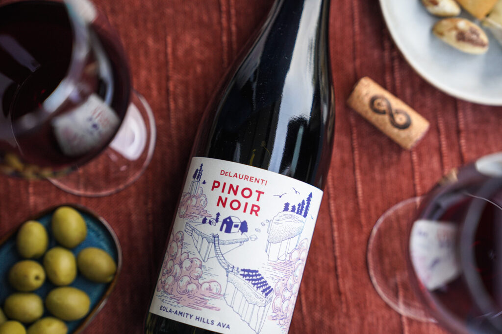
Pinot Noir: coming home
The 2024 Pinot Noir brought the project home to the Northwest. The wine is made by Chad and Bree Stock, of Constant Crush and Limited Addition, from the Eola-Amity Hills. The label shows the hills and trees around the winery as floating islands, with volcanic soil underneath and clouds moving between them for the cooling winds of the Van Duzer Corridor. “I think this is probably Angela’s best work, in terms of how much the label says without literally saying much,” Tom says. With some experience working on imported labels, we enjoyed applying what we’ve learned to our home turf. “Tom is something of a dream client,” says Angela. “He’s got great ideas that are well-conveyed and then he is also totally on board for what comes out of the design process.”
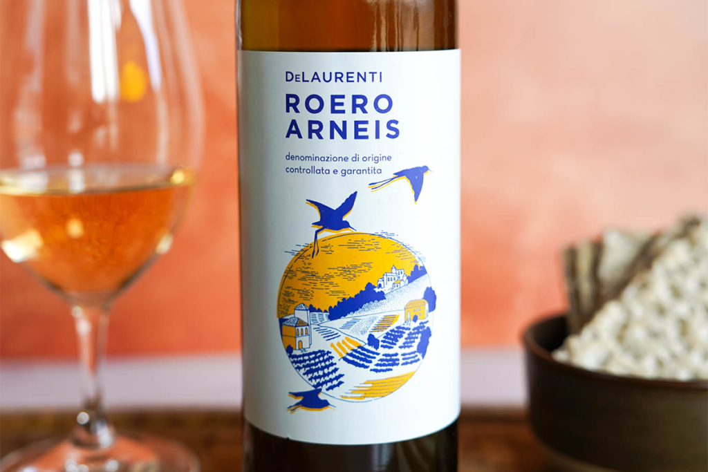
Roero Arneis: a fever dream
Arneis is Piedmont’s native white, grown for centuries on the same hills as Barolo and Barbaresco. By the 1980s it had nearly vanished. A small band of growers brought it back, and today it’s Roero’s calling card. Ours comes from the sandy slopes of Santo Stefano Roero: fresh fruit and white flowers on the nose, crisp on the palate, with a clean mineral finish.
“We are hearkening to a place and fairly on the line regarding the typical vineyard scene,” says Angela. “But it’s dynamic, almost as if you are flying over yourself. Feel that breeze!” Ask Tom about the design and he’ll tell you it’s a blur. “To be honest, it’s kind of a fever dream,” he says. “I think it was purely house style coming through.” What he does remember is how fast it went from idea to shelf. Angela agrees. “It WAS a fever dream. We did the bulk of the work in the gap between holidays and full-steamed with our best instincts.”
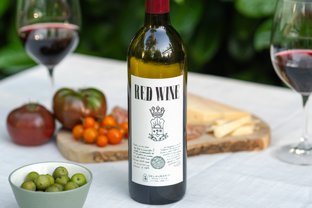
Red Wine: a napkin sketch
This everyday red is made in Washington with Italian roots, crafted in the same way as the great Super Tuscan Tignanello. Most of our labels start with a vision board: other wine labels we like, photos of the vineyard, the region. This one started with a specific label, a landmark design by Silvio Coppola. “The design is so elegant, modern, and pristine,” says Tom. That became our reference point. “I was nervous about this one,” says Angela. “It can be so difficult to walk the line between copying something and paying homage to something.” What emerged is a design that feels like it was drawn on a napkin — by an exceptionally talented and creative artist. “That was what I was trying to do, though of course it only came about after hours of tearing my hair out in a totally different direction,” says Angela. Our label is an homage to the classic. “It has this honest, first-draft, everyman sort of feel to it that I love,” says Tom.
What’s next?
So what should we do next? We have a few ideas, but we’d rather hear yours. Tell Tom the next time you’re in the shop, or email tomd@delaurenti.com.
Interested in the full flight? Here’s the easy way